
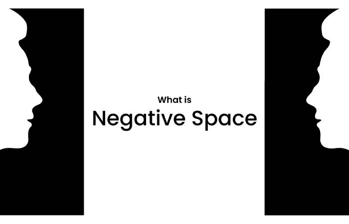
Negative space, also known as white space, is an essential component in the world of graphic design. It refers to the empty areas surrounding and sometimes within design elements. When utilized effectively, negative space can dramatically improve a design’s visual impact, making it more engaging and thought-provoking. In this blog post, we’ll explore a variety of techniques to incorporate negative space into your design projects and delve into the benefits it can offer.
Table of Contents
The Art of Balance
One of the primary roles of negative space is to provide balance within a design. A harmonious layout requires the thoughtful distribution of positive elements (the subject matter) and negative space. By striking the right balance, you convey a sense of stability, clarity, and order, which ultimately makes your design more attractive and easier to comprehend.
Negative Space in Text-Based Designs
Negative space is also extremely relevant in text-based designs like invitations, where readability and visual appeal are crucial. For instance, incorporating negative space in birthday text message invitations can help emphasize important information.
Such as the date, time, and location of the event, while making the invitation visually pleasing and easy to read. Keeping spaces around texts and graphical elements will result in a clean, attractive, and well-separated design that recipients will appreciate.
Highlighting Focal Points
Negative space is a powerful tool for drawing attention to the focal points of your design. By surrounding your central element with ample vacant space, you can make it appear more prominent and noticeable. This selective use of empty space can help guide viewers through your design, emphasizing crucial elements and allowing your intended message to be easily understood.
Creating Visual Interest
Negative space isn’t just an empty void – it can capture your audience’s eye and create impressive visual effects. Many iconic logos and designs employ negative space to evoke emotion, provoke thought, or convey a message within their artwork. For example, the infamous FedEx logo features an arrow hidden between the ‘E’ and ‘x,’ illustrating the company’s dedication to forward movement and delivery.
Enhancing User Experience
In web and app design, negative space contributes to a more intuitive and enjoyable user experience. A clutter-free interface with well-defined elements makes navigation more manageable and helps users understand, locate, and interact with essential functions. By decluttering design elements, you can prevent your users from feeling overwhelmed and encourage them to stay engaged for longer periods, ultimately enhancing their overall experience.
Improving Legibility
Layouts with ample negative space often result in improved legibility and easier-to-read designs. This is particularly important in typography, where the balance between text and emptiness determines the readability of your content. By allowing your words to breathe, you ensure a more straightforward and fluid reading experience for your audience while reducing visual fatigue.
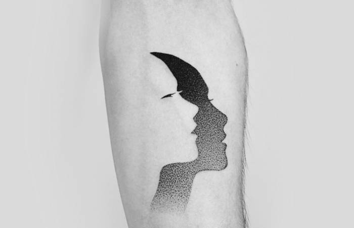
Negative Space in Illustration
Illustrators can also benefit from incorporating negative space in their artwork. By letting specific areas remain vacant, artists can effectively guide the viewer’s attention toward specific elements and create an eye-catching composition. This purposeful use of negative space can tell a story, evoke emotion, or add depth to an otherwise flat illustration, making the overall design more engaging and memorable.
Incorporating Negative Space in Your Designs
- Start with a clean canvas: When beginning a design, aim for a minimalist approach that focuses on essential elements, and gradually add details as needed. This helps in preventing a cluttered and chaotic result.
- Avoid overloading: Resist the temptation to fill every inch of your layout. A crowded design can hinder legibility and fail to deliver your intended message effectively.
- Embrace asymmetry: Although balance is essential, asymmetry can also create intrigue and direct attention towards your focal elements. Play with proportions and contrasts to maximize the visual impact of your design.
- Experiment with shapes and colors: Shapes and colors can create engaging negative spaces, adding depth and personality to your design. Use them strategically to emphasize your subject matter and enhance visual interest.
Experimenting with Different Design Mediums
As you learn to master the art of negative space, don’t hesitate to experiment with various mediums and art forms. From digital to traditional art, each medium offers unique challenges and opportunities to explore the potential of negative space. By stepping outside your comfort zone and trying different materials and techniques, you open the door to discovering new methods of utilizing the transformative power of negative space.
Negative Space in Photography
Utilizing negative space in photography can create a bold and captivating visual effect. By placing your subject off-center and surrounding it with empty space, you allow the viewer’s eye to naturally drift toward the subject. This technique not only adds depth and dimension to your photographs but also creates a sense of balance, emphasizing the importance of the subject matter.
Final Thoughts
Negative space, when harnessed effectively, can significantly elevate your designs and help deliver a clear and powerful message. By incorporating the principles of balance, focal points, legibility, and user experience, you’ll create visuals that leave a lasting impact on your audience and garner the attention your work deserves. So, the next time you start a design project, remember that sometimes, less is more – and allow negative space to unleash its transformative power.