
Channels publishing weekly can look assembled when every video invents its own titles again. Viewers rarely name this problem, but they still notice the visual inconsistency quickly. The fix is using consistent text styles instead of making fresh design decisions.
Filmora video editor can hold these styles once they have been properly created. You can create animated text that stays recognizable across an entire video series. This guide covers the decisions, building process, saving steps, and reuse of styles.
Table of Contents
Part 1. Define the Main Text Types
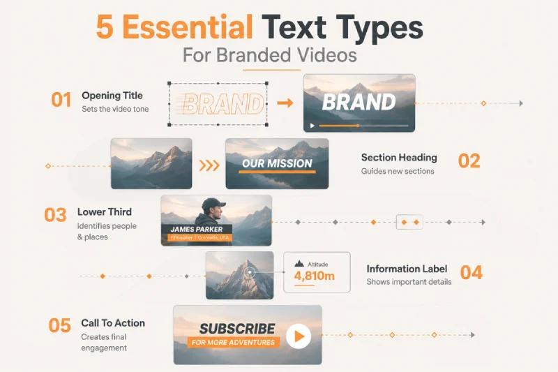
Before changing settings, identify the main text jobs used throughout each branded video. Most branded video series need only 5 text types for consistent visual communication. Filmora organizes similar title options, helping keep each text animation purpose defined. Let’s examine the main text types that cover most branded video projects:
- Opening Title: Introduces the series name and establishes its visual tone with noticeable movement.
- Section Heading: Signals a new video section and should remain easy to read quickly.
- Lower Third: Identifies a speaker, location, or role without distracting from the footage.
- Information Label: Displays prices, dates, statistics, or details viewers may need to reference.
- Call to Action: Ends the video with a clear message that stays visible longer.
Part 2. Set the Brand Typography and Colors
Set clear typography and color rules to keep all 5 text types consistent. The table below outlines the core brand elements to define before designing:
| Decision | What to Fix | Why It Matters |
| Font Family | One typeface, or two at the very most | More than two fonts reads as clutter, not variety |
| Size Hierarchy | Three sizes, from opening title down to labels | A fixed ladder tells the viewer what ranks above what |
| Text Color | One brand color plus plain white or black | Extra colors compete with the footage underneath |
| Outline or Shadow | One treatment, applied the same way every time | This keeps wording readable over busy shots |
| Spacing | Fixed letter and line spacing for each size | Loose spacing on one title breaks the pattern |
Part 3. Choose a Consistent Animation Pattern
Typography defines the text appearance, while movement gives each title its character. Using an animated text maker, keep entrance and exit effects consistent across titles. Now, look at the table to choose suitable animation patterns for each use:
| Safe Across a Whole Series | Better Left to One-Off Videos |
| A short fade or slide on entry | Bounces, spins, and typewriter reveals |
| The same exit on every text type | A different exit chosen video by video |
| Movement that ends before the speech starts | Movement that runs under dialogue |
| Loop kept for a static corner badge | Loop on a lower third or a heading |
Looping lower thirds can distract viewers from speakers and make information harder to follow. Restrained movement keeps titles readable and helps branded videos remain visually current longer. The Filmora Video Editor for Mac provides title tools for building consistent branded video designs.
Part 4. Build the Branded Text Style in Filmora
With your brand rules defined, you can create animated text over representative footage. Go through the steps below to build a reusable branded text style in Filmora:
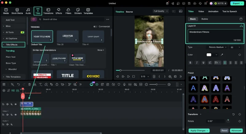
Step 1. Add a Representative Title
First, import your video and drag and drop it over the timeline. Next, access the “Titles” tab and choose “Title Effects.” Then, drag and drop “Default Title” over your video and enter a sample text.
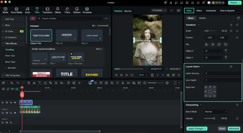
Step 2. Apply the Typography Rules
Once done, move towards the “Text” section in the properties panel and set the font, size, color, outline, and shadows. Expand the “Layout Option” section and set the “Line Spacing” and “Line Height.”
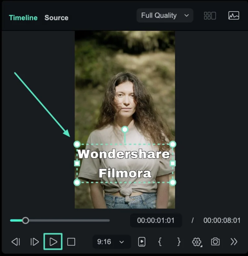
Step 3. Place It in the Frame
Next, position the title where it sits well in every frame and keep it clear of the edges. Play the video to check how the text appears over movement in that corner.
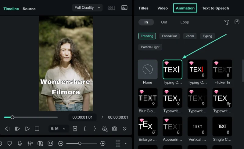
Step 4. Apply and Time the Animation
Afterward, click the “Animation” tab and choose a template for “In,” “Out” or “Loop” frames. Play the result over the footage before going further.
Part 5. Save the Customized Text as a Preset
Saving a styled title makes your animated text maker setup reusable across projects. Below are the steps for saving customized text as a reusable Filmora preset:
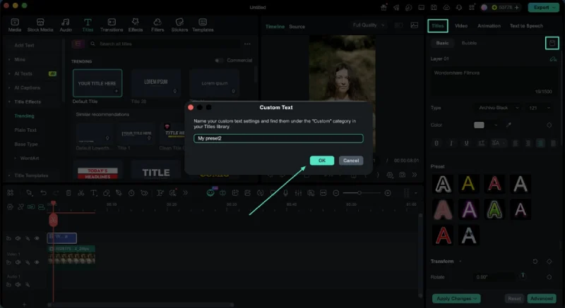
Step 5. Save the Style and Name It
After the animation is applied, switch back to the “Titles” tab and make other text changes before pressing the “Save as Custom” icon. Your title preset will be saved in the “Custom” category of “Titles.”
Step 6. Confirm the Saved Preset
Add the saved preset to an empty timeline track and preview the title. Check whether its text styling, position, and animation remain applied. If the movement is missing, reapply the chosen animation before using the preset.
Part 6. Test the Preset with Different Text Lengths
Test your text animation with both short and long wording before reuse. The table below shows what to check when testing different text lengths:
| What to Check | What Goes Wrong |
| Line Breaks | A long title wraps onto a second line and covers the speaker |
| Position | Centered wording shifts upward as soon as a second line appears |
| Animation Duration | A slow entrance eats most of the screen time on a short label |
| Frame Fit | Wide wording runs past the safe area on a vertical export |
| Readability | An outline that worked over sky disappears over a bright wall |
Part 7. Document the Usage Rules
Testing confirms the preset works, but clear rules help maintain brand consistency. Document each preset so other editors understand how every style should work.
Record What Each Preset Is For
List each preset name beside the specific text type it should support. Note its intended screen position so editors place each title without confusion. Clear preset labels also prevent editors from choosing styles for incorrect purposes. The Filmora Auto Reframe guide covers frame adjustments when branded videos need different aspect ratios.
Say What May Be Changed
Allow wording, clip duration, and vertical position to change when projects require. Keep fonts, sizes, colors, and animation fixed to protect the brand style. Anyone using Filmora as a text animation maker should share these rules.
Conclusion
A good text system reduces design choices while keeping every video consistent. Fixed fonts, colors, and text animation help maintain the same brand style. Filmora presets make these design choices easier to reuse across video projects. Keep each preset flexible enough to support new titles and different layouts.